Food Foresight Smart Kitchen & Grocery Assistant
Food Foresight is a smart kitchen and grocery management app that helps users track food items, manage expiry dates, plan meals, and get personalized suggestions. The platform provides grocery recommendations, expiry reminders, recipe guidance, and seamless checkout all tailored to cooking level and dietary preferences.
.png&w=3840&q=75)
Role
Product & UX Designer (Lead)
Platform Capabilities:
- Personalized grocery suggestions based on cooking level and dietary preferences
- Expiry date tracking with smart reminders
- Grocery organization by storage type (fridge, freezer, pantry)
- Recipe recommendations with step-by-step guidance
- Seamless cart and checkout with multiple payment options
- Analytics for grocery usage, trends, and meal planning efficiency
Team

2 UI/UX Designers
1 Product Managers
4 scrum teams x 12 people each
Timeline
Feb 2023 — Apr 2023 | 3 months
Deliverables
User & Stakeholder Insights Food Foresight.
Internal teams including product managers, engineers, and support staff were consulted to identify common pain points.
Discussions revealed that users frequently contacted support due to confusion around:
- Grocery categorization (fridge, freezer, pantry)
- Expiry reminders and notifications
- Recipe suggestions and personalized meal plans
- Payment and checkout issues
“I never know which ingredient to use, and I’m always worried about food going bad without realizing it.”
Novice Home Cook
“Managing multiple meals and tracking grocery items without visibility is extremely difficult.”
Meal Planner
“I want recipes and meal suggestions to adapt depending on my dietary needs and cooking level, but there’s no easy way to control that.”
Professional Home Cook





The Existing User Flows Had Opportunities consolidation and simplification.
Starting a task from Dashboard, Grocery List, or Meal Planner led users through a multi-step flow to check item status, select ingredients, adjust quantities, and confirm meal plans before proceeding. However, this process was repeated across all entry points, regardless of how the action was initiated.






Users weren’t clear about how to filter and view the right business data.
Users often struggled to understand which metrics belonged to which grocery category, recipe type, or storage location. Without proper filtering, insights around food usage, expiry dates, and meal planning efficiency felt mixed and hard to act on.
Billing / Payment Insight
Clearly displays grocery costs, ingredient pricing, and checkout totals based on selected filters (e.g., storage type, recipe category) to reduce confusion.


Usage / Performance Insight
Provides real-time visibility into ingredient usage, meal prep interactions, and recipe performance based on applied filters (e.g., dietary preference, cooking level).
Billing / Payment Insight
Clearly displays grocery costs, ingredient pricing, and checkout totals based on selected filters (e.g., storage type, recipe category) to reduce confusion.
Usage / Performance Insight
Provides real-time visibility into ingredient usage, meal prep interactions, and recipe performance based on applied filters (e.g., dietary preference, cooking level).
Improve clarity across recipes, inventory tracking and meal planning to reduce confusion.
Goal 1
Improve clarity across ingredients, recipe suggestions, and expiry tracking to reduce confusion.
Goal 2
Create a flexible, scalable system that helps users manage groceries, meal plans, and dietary preferences efficiently.
Success Metrics
Reduce user error
Improve ingredient visibility, expiry reminders, and recipe suggestions.
Reduce customer support requests
Minimize confusion around ingredient tracking, shopping lists, and notifications.
Increase user satisfaction
Make grocery insights easier to understand and manage.
Enable cross-platform usage
Ensure a smooth experience across all app features.
User personas enabled a shared understanding of user behaviour within the team.
The UX research identified 6 personas that interact with Food Foresight. For this case study, we focused on the two personas most impacted by grocery management, meal planning, and recipe recommendations: Home Cook and Meal Planner.

Sarah Ahmed
Home Cook
Age
Gender
Status
Education
Location
29
Female
Single
Bachelor’s Degree
Urban Area
I want to manage my groceries efficiently, track ingredient expiry dates, and get recipe suggestions based on what I already have without wasting time searching multiple apps.
Bio
Sarah is a home cook who manages groceries, plans meals for the week, and tracks ingredients in her kitchen daily. She relies on recipe apps and grocery lists to stay organized but feels frustrated when ingredients expire unnoticed or when recipes don’t match what she already has at home. She wants a single platform that helps her manage groceries, track expiry dates, and suggest recipes based on available ingredients.
Goals
- Plan meals efficiently for the week
- Track ingredient expiry dates easily
- Reduce food waste at home
- Get recipe suggestions based on available ingredients
Frustrations
- Ingredients expiring without reminders
- Difficulty tracking items in fridge, freezer, and pantry
- Recipes requiring ingredients she doesn’t have
- Using multiple apps for groceries and recipes
Personality
Research Tools
- Curious
- Practical
- Organized
- Independent
- Analytical
Cooking & Kitchen Tools
- Grocery Inventory Management
- Recipe Discovery
- Meal Planning
- Expiry Date Tracking
Influences
- Food Blogs
- Cooking Communities
- Recipe Websites
- Kitchen Management Apps
Frequently used apps
- YouTube
- Google Keep
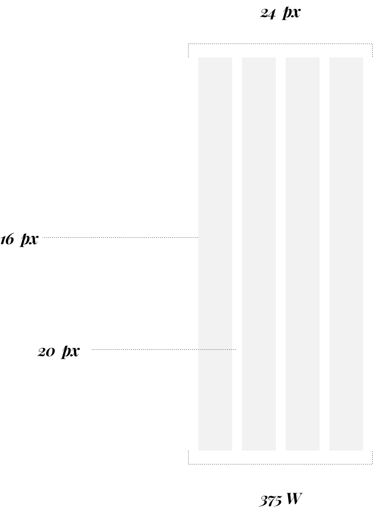
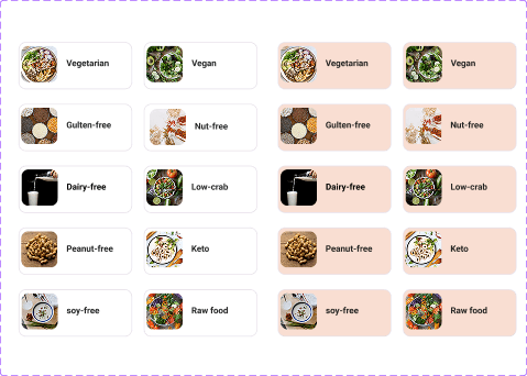
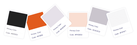
A unified design system ensured consistency across the ecosystem
A shared design system was created to support the website, mobile app, and admin panel. Components, typography, spacing, and interaction patterns were standardized to ensure consistency and faster iteration.
A mobile-first approach shaped prioritization
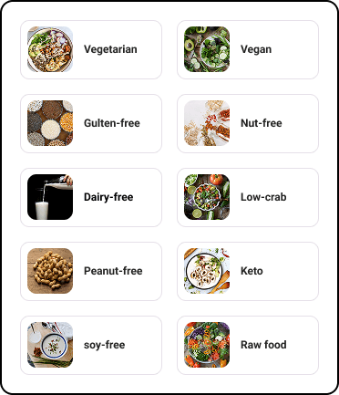
Designing for mobile ensured that essential features like grocery tracking, recipe discovery, and meal planning were prioritized first. Progressive disclosure was used to reveal advanced options such as dietary preferences, inventory categorization, and expiry reminders only when needed, keeping the experience simple and easy for users without overwhelming them.
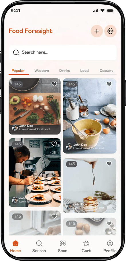
A closer look at the design enhancements
Small but impactful improvements were introduced throughout the app to improve clarity, reduce food waste, and guide users smoothly through grocery tracking, recipe discovery, and meal planning features.
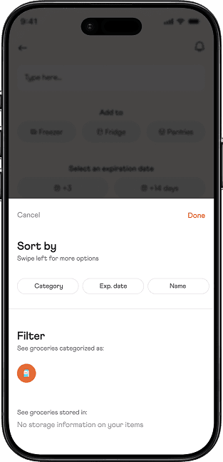

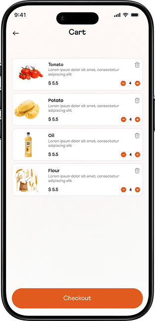

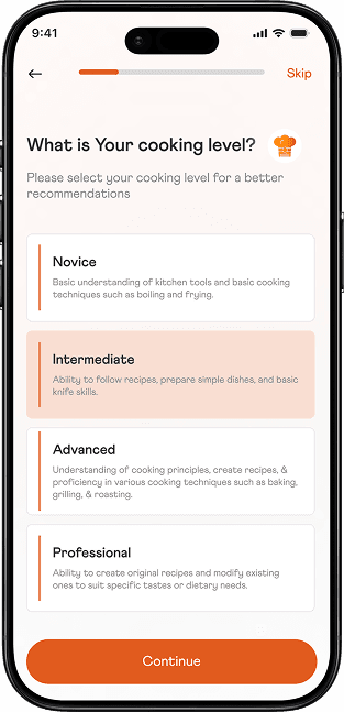

Usability testing results Users Understood Services and Metrics Better
Identified UX
Challenges
Hidden Tools
Users struggled to quickly find recipes, grocery items, or inventory details on mobile.


Complex Navigation
Key actions required too many steps to add ingredients, scan items, or create meal plans.
Lack of Immediate Context
Ingredient availability, expiry status, and recipe suggestions were not visible at a glance.
Implemented UX
Solutions

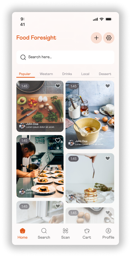
Feature-First Layout
Core features like recipes, grocery tracking, and meal plans surfaced directly on the home screen.
Quick Action Access
A scan-and-quick-add action enables fast entry into tasks like ingredient scanning, grocery adding, and meal planning.
Clear Visual Hierarchy
Expiry alerts, available ingredients, and recommended recipes prioritized for mobile-first view.

Usability testing with in the right direction
- Usability testing confirmed users could find recipes and manage groceries faster and navigate the app more confidently
- Users better understood cooking levels, dietary preferences, and available recipe options
- Ingredient visibility and recipe suggestions helped users plan meals more easily and complete tasks smoothly on mobile
Identified UX
Challenges
Hidden Tools
Users struggled to quickly find recipes, grocery items, or inventory details on mobile.
Complex Navigation
Key actions required too many steps to add ingredients, scan items, or create meal plans.
Lack of Immediate Context
Ingredient availability, expiry status, and recipe suggestions were not visible at a glance.
Implemented UX
Solutions
Feature-First Layout
Core features like recipes, grocery tracking, and meal plans surfaced directly on the home screen.
Quick Action Access
A scan-and-quick-add action enables fast entry into tasks like ingredient scanning, grocery adding, and meal planning.
Clear Visual Hierarchy
Expiry alerts, available ingredients, and recommended recipes prioritized for mobile-first view.
Usability testing with in the right direction
- Usability testing confirmed users could find recipes and manage groceries faster and navigate the app more confidently
- Users better understood cooking levels, dietary preferences, and available recipe options
- Ingredient visibility and recipe suggestions helped users plan meals more easily and complete tasks smoothly on mobile
Comprehensive design documentation streamlined development for a cohesive end product
Detailed design documentation, annotated screens, and interactive prototypes were shared with engineering teams to ensure accuracy and consistency during implementation.